Over half of consumers start their shopping journey on Amazon.
And more now that ever before, consumers say convenience, speed, and a great shopping experience are some of the most important expectations consumers need to meet.
What does that mean for ecommerce businesses today? It means your customers regularly interact with one of the largest digital retailers in the world and they’re expecting you to live up to the precedents it sets.
Seem impossible? Quite the opposite. Somewhat paradoxically, at the same time consumer expectations are hitting an all-time high—so is their distrust of large, impersonal brands and their interest in shopping smaller. We think right now is the sweet spot when brands can win loyal customers by implementing user experience and website design that provides the convenient, quick, and delightful shopping flow they crave.
Just to prove we aren’t completely crazy and it really is possible for a “normal” ecommerce company to create a stellar shopping experience that can compete on a global stage, we put together this list of companies in the sports and leisure category who are crushing it with their website user experience and design.
Our staff compiled the list of awesome brands you’re about to discover after tens of hours pouring over more than a thousand sports and leisure websites from all around the world. They made sure each website met the following criteria before it could be added to our “hall of fame” for awesome user experience and design:
- Navigating to products and other key areas of the website was intuitive
- The visual design was creative, unique, and increased usability
- The layout made using the website delightful
- Products were easy to purchase
Interested to see if you shop with any of the retailers on this list? The answer is just a scroll away.
Hyperlite Mountain Gear
Hyperlite’s web design stays true to the same philosophy to which they hold their hiking products: “Precisely what's needed. And nothing more.” The web design is minimal yet still striking, their layout presents everything you need—and nothing you don’t—to access their products and information, and the way their product pages flow into the checkout process is delightfully streamlined for users.
Jimmy Sytks
Plenty of stand up paddle board websites have gorgeous photography to fall back on. Where Jimmy Sytks’ website sets itself apart is in the user experience and design department where it couples that gorgeous photography with super quick access to the actual products and content the brand produces. They sure know what’s SUP!
Oveja Negra
From their URL to their refined website design and graphics, it’s obvious that Oveja Negra sells bags for bikepacking. The overall simplicity continues to be effective as their product pages segue right into a checkout experience that almost makes it too easy to ship a few hundred dollars worth of bike bags to my home. I mean, it even recognized that my information is already stored in the third-party ecommerce platform they use!
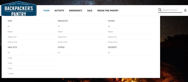
Backpacker's Pantry
Backpacker’s Pantry counters the overwhelm of choosing the right food for camping, hiking, climbing, emergency situations, and beyond by making it easy for site visitors to sort their freeze-dried meals by activity, dietary restriction, or type. Despite having a wealth of products and content; thoughtful design makes it so that users can educate themselves, add the right products to their cart, and complete checkout in a snap.
Helinox makes great use of beautiful lifestyle photography by incorporating them into a large section at the top of the website that drives visitors to some of their best-selling categories and products. Each portable chair and table’s product page furthers their detailed yet simple approach to the shopping experience.
Arbor
Arbor makes shopping effortless with a homepage design and navigation menu that invites you to access either their snow, skate, clothing, or accessories section. Each of these sections acts as a subsite that keeps the same subtle design while revealing more about specific product categories and special items. Product info, reviews, and specs all live on a single page. And if you decide to add anything to your cart, a slick slide-out design element helps you recall what’s in your cart and gives you the option to keep shopping or head straight into the checkout workflow.
Goalrilla
Searching for a basketball hoop, training supplies, or, well, something else? Look no further than Goalrilla’s navigation bar that makes it easy to find what you need from the moment you land on their website. We find that the quick link to customer service, the buyer’s guide, and the ability to search for products nearby before purchasing them online are all thoughtful touches that add to the user experience.
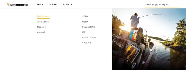
Humminbird
Do you want to shop, learn more, or get support? Humminbird greets you with these options, each broken down into further categories, right in the main navigation of their bright, organized website. Keep scrolling and the design will lead you to learn about their fishing technology, products, content, and plenty more. Product pages chocked full of details, manuals, and resources ensure the buyer enjoys a smooth experience all the way through purchase.
Black Crows
With strong black and white branding and a navigational menu that directs you straight to their foundational skiing products; Black Crows’ user flow and website design are as striking as their name. Detailed product pages amp up the user experience and several purchasing options allow shoppers to find the product at a local dealer, purchase it online, or participate in a rental program.
MiiR
If you didn’t already know what kind of products MiiR specializes in, one look at their website will tell you everything you need to know. On every page (as well as in the navigation menu), the design is infused with information about the drinking vessels they offer, how to customize them, and their dedication to giving back. Once a visitor finds the product they’re looking for; shipping info, reviews, customization options, and of course the purchasing workflow are all readily accessible.
Haydenshapes Surfboards
Haydenshapes knows that all watersports websites don’t have to be created equally. They bring the same modern, artistic take to their website design and user flow as they do to their boards. Truly dynamic features allow users to find the right board for their specific measurements and the innovative “studio” portion of their website empowers visitors to build a custom board from the material to the finish.
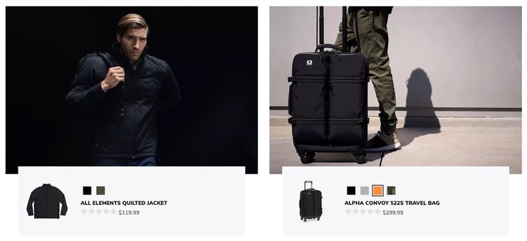
Ogio
If you can’t tell, we sure do love it when product photography and user experience-focused design come together on a sports and leisure website. Ogio nails it with lifestyle photos that make their travel and sports gear look so damn good we’re instantly sucked into their organized product pages and simplified checkout process—complete with the assurance of a secure checkout and plenty of product upsells.
Hagan Ski Mountaineering
Hagan’s website goes to show that website design doesn’t necessarily have to be cutting edge to work. Where Hagan shines is in its ability to make a truly impressive skiing catalog accessible from the navigation menu alone. Once you finally choose a product to view and add to your cart, a quick popup prompts you to check out but disappears if you decide to keep using the site.
Skylon
Skylon communicates their most important messaging through sleek, on-brand web design that highlights their pride in their country, their experience, and their commitment to wakeboarding. The messaging and design simplicity wisely carry over to a decked-out (pun intended!) description page where their singular, high value product lives.
PEARL iZUMi
PEARL iZUMi’s user experience and web design knows what it’s all about—engaging visitors enough to either convince them to purchase a product or opt into ongoing marketing. While the navigation keeps a deep product catalog of biking clothes and accessories organized with smart nesting; the home page manages to blend product highlights, user-generated stories, and information about their “Here We Go” campaign that almost makes me want to sign up for their marketing emails.
Atomic
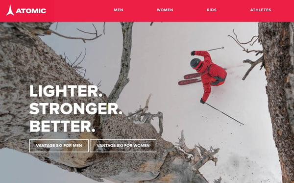
If you’re going to go through the trouble of taking sick photography for your website, might as well make it useful—right? That’s exactly what Atomic does with an eye-catching skiing image overlayed with buttons and text that immediately make site visitors want to go check out their latest gear. A dynamic navigation bar serves up relevant educational materials and continues to pull you deeper into the website and closer to purchasing product.
ICEMULE
For the vast majority of us who didn’t know adventure coolers were a thing, ICEMULE’s website design immediately makes it clear with lots of photography that show people wearing and using their soft-sided backpack coolers in a variety of situations. And once you use the bold navigation menu that invites you to shop, explore, and experience; you’ll also learn a lot more about the design, specs, reviews, and how to purchase each piece.
Odyssey Golf
In the world of golf, there are tons of gear and tons of accessories. Odyssey Golf stands out with bold design that directs website visitors to their most important products. Even once you’re deep in the shopping experience, their UX design wisely makes use of secondary menus so users can continue to narrow down their search to find exactly what they’re looking for.
Cycliq
Cycliq pulls off what plenty of websites fail to—two main navigation bars that actually make it easier to navigate the site instead of harder! The product-focused navigation makes getting to their offerings as smooth as the bright “add to cart” button makes it to commence the purchase process. As for visual design, Cycliq also made the smart choice to match their branding to the simple color pallet that their biking safety products use for a delightfully consistent user experience.
Big Agnes
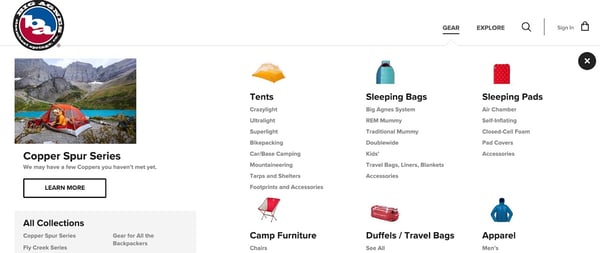
From the get-go, the Big Agnes website invites users to choose one of three experiences: check out gear, explore, or keep scrolling for tons of fun photography featuring their tents, clothing, sleeping bags, and other gear in action. If you choose either of the options in the simple navigation menu, another fully-designed menu opens up to either show off their entire gear catalog or point you to a resource where you can learn more about their technology, ambassadors, and beyond.
We’re sure you’ll agree that taking the time to plan and execute a delightful user experience and design for your website is a great way to win and keep consumers. You’ll probably also agree that finding that time could very well be the most difficult part of the equation.
You are why we built Plytix—product information management (PIM) software for crazy-busy ecommerce marketers, managers, and business owners who need to automate the centralization, optimization, distribution, and analysis of their product data so they can get back to big-picture projects like website experience and design.
We even took our own advice and made the Plytix platform easy to look at and even easier to use no matter your company size, product type, or number of sales channels. Ready to give us a try? Sign up and get in touch with our hands-on customer success team, or dive into one of our robust yet affordable all-in-one packages. It’s time to get more cool shit done faster with Plytix.

