Out with the old and in with the new!
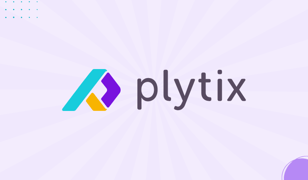
As of today, we’ve officially upgraded our logo and color palette. And you might be wondering, why the change? Well, we say, why not? It’s about time. We’re sure you’ll love it!
In the past few years, we’ve grown in leaps and bounds. And it’s time for our branding to catch up and reflect all the growth that makes us who we are today. So, we aren’t starting from scratch with our new branding but showing the natural evolution of our growth.
“The new logo was a long time coming. We’re getting more attention at events and social media, and we felt like our current logo didn’t stand out, especially since many tech companies have similar logos. When creating the new one, we wanted it to have more character, a fresh feel, and be different. We’re really excited to see it live and hear what people think.”
—Angela Cassini, UI specialist at Plytix
To give you a better idea of how our Design team decided to evolve our new logo, we’ll go through how they handpicked each new element of the design.

The New Logo
When looking at our new logo, one of the first things you’ll notice is that the icon forms the letter P (for Plytix, of course!). We also angled the P to create a box shape inside of the letter as a reference to our old logo (which also represents a box you’d use as packaging for a product). As for the colors, we implemented the three main colors from our color palette to represent our main pillars: our values, our culture, and our product.
We even upgraded our font to make sure it gives off friendly vibes, thanks to the soft corners of the text. We wanted to incorporate a font with soft corners as a representation of our transparency as a company—we don’t need to hide anything away in those hard corners.
The New Color Palette
As you can see in the logo, we’ve also refreshed our color palette. We found colors that are bright and playful (inspired by the bright and fun 80s style). Our designers chose three main colors to represent the three main pillars of Plytix, which are:
- Purple: This represents our product, the PIM itself. We chose purple not only because it has been the most consistent brand color throughout our time as a company but also because purple symbolizes power (and, more specifically, the power of our technology).
- Yellow: This represents our values. Yellow is a vibrant, fresh, yet playful color that reflects our main principle at Plytix, which is “Don’t be a jerk, don’t hold back, and don’t forget to have fun.” It reflects the optimism of supporting each other to reach the same goal without any fear, all while working together.
- Blue: This represents our culture. Blue is a color that gives off a sense of trust, freedom, and inspiration. All of these make up an accurate depiction of how our culture is. It reflects the trust we give each team member, the freedom we have to do our best work, and the inspiration we have to make a user-centric product for any business that wants to succeed in ecommerce.
And besides, our main office is based in Málaga, Spain, close to the blue Mediterranean Sea—so it just seems right.
We hope you love our new rebranding as much as we do! Don’t forget to check it out, whether it be on our product, website, or social media.
_______________________________________________About Plytix:
Plytix is one of the leading Product Information Management (PIM) tools on the market, specially designed for small to medium-sized manufacturing, wholesale, and retail businesses. It is a collaborative, single source of truth created to help you effectively and efficiently manage product information so your business can be successful.
Want more news on what we are up to? Make sure to follow us on social media!
- LinkedIn: Plytix PIM
- Instagram: Plytix & Plytix Lifestyle
- Facebook: Plytix
- TikTok: Plytix.com
- Youtube: Plytix


