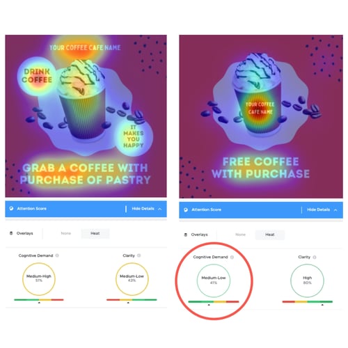
Did you know that our brains can process visual data faster than text because it’s easier to digest information? Well, the success of visual-driven social media platforms such as Instagram, Pinterest, and TikTok is a testament to this concept.
As it stands, the total average time users spend on social media is two hours and twenty-four minutes. That’s a lot of screen time you can use to your advantage.
But along with the understanding that visual content is the key driver of customer attraction and engagement, comes the intense competition from brands vying for customer attention. So, how do you create visual content that stands out from the rest? Use science-backed attention scores: cognitive demand and clarity.
The role of cognitive demand score in content
Cognitive demand is all about the time and level of difficulty customers experience when trying to understand your content. For this, you’re looking to get a low cognitive demand score as it indicates that customers process, analyze, and understand your content within a few seconds. A high cognitive demand score means that it takes customers longer to understand your content. A high cognitive demand score could mean that customers lose interest in your content and will scroll past without engaging with it. When you use TINT, a tool that can help you discover the cognitive demand and clarity scores of your visual content, you can really see the elements that quickly attract the attention of customers.

The role of clarity score in content
A high clarity score refers to the visibility of your content. If the most important parts of your content are hard to see and understand, your content will get a low score. The only way to ensure that your score is high is to make the critical parts of your content easy to spot and understand. So, as you can see, the goal is to get a low cognitive demand score and high clarity score for each of your visual content.
How do you make that possible?
4 ways to create attention-grabbing social content
Drawing attention to your content means zoning in on the attention-grabbing elements of your content. This is not what looks good to you or what you think customers are looking for; it needs to be tested. While it’s good to look at what your competitors are doing, you can’t simply build a strategy based on that. Getting true engagement requires that you appeal to what customers like. Here’s how to enhance your visual content on social media to drive high performance.
1. Use faces in your content
Psychology suggests that we are wired to respond to faces as we use them to search for social cues. We’re naturally drawn to faces and tend to look at what the faces are looking at to observe and understand what is going on. Using this human perception in your visual content will give you the attention you’re looking for.
For example, in the ad below, the eye-tracking heat map found that users focused on the baby’s face first and immediately followed the baby’s gaze at the copy.
The baby’s face acts as a visual cue to direct people on where to look.

2. Keep the visual content clean
Social media has an influx of information, and processing takes time if there’s a lot of text in it. If there’s a lot going on in your visual content, it will most likely achieve a high cognitive demand score and a low clarity score. Why? Because your customers won’t quickly figure out what is going on fast enough, which will lead them to scroll past your copy and not engage with it. The goal here is to keep your visual content as clean and simple as possible, showing only what needs to be there. The example below shows what clean visual content looks like.

3. Use colors that evoke emotions
Color captures attention, and we use it as a cue to detect the most important information in visuals we’re looking at. The use of colors is not only meant to emphasize important bits of information but also to evoke moods and feelings.
When customers glance at your content, they are quickly attracted to the colors used. When they can feel the emotions you’re trying to communicate, they'll take the action you need them to take. According to this article, the addition of color can “reduce errors, reduce search time, and increase comprehension.”
4. Focus on the "fovea" of your image or video
We all believe that we look at a picture as a whole, but science suggests that we, in fact, only see a small portion of the picture in a single moment. This is typically the front and center of the picture (the area in which our eyes are quickly drawn to and sharply focused on). This area is called the fovea, and this is the part where you can strategically place the most important information in your visual content, be it an image or video. The best way to know for certain what works for your specific customers is to do an A/B testing experiment to get into the heads of your customers and better understand what attention points appeal to them.
Make sure this visual content has a place to live
Now that you understand the science behind what grabs visual attention, do you have a centralized location to store this imagery? If you’re thinking of storing it anywhere other than in digital asset management (DAM) software, think again.
A DAM tool ensures efficiency so that you won’t experience headaches with old-school file storage systems such as Dropbox folders, etc. Of course, an image means nothing without product information to support it. So, step it up a notch with product information management software that has DAM capabilities.
Ready to try the best PIM for ecommerce? Get Plytix for free here.


